To a clear brand voice: How Investiere.Dich.Frei gains new customers with Webflow
Investiere.Dich.Frei
Client
3 months
Kick-Off until Launch

Düsseldorf
Location

Bootstrapped
Financing

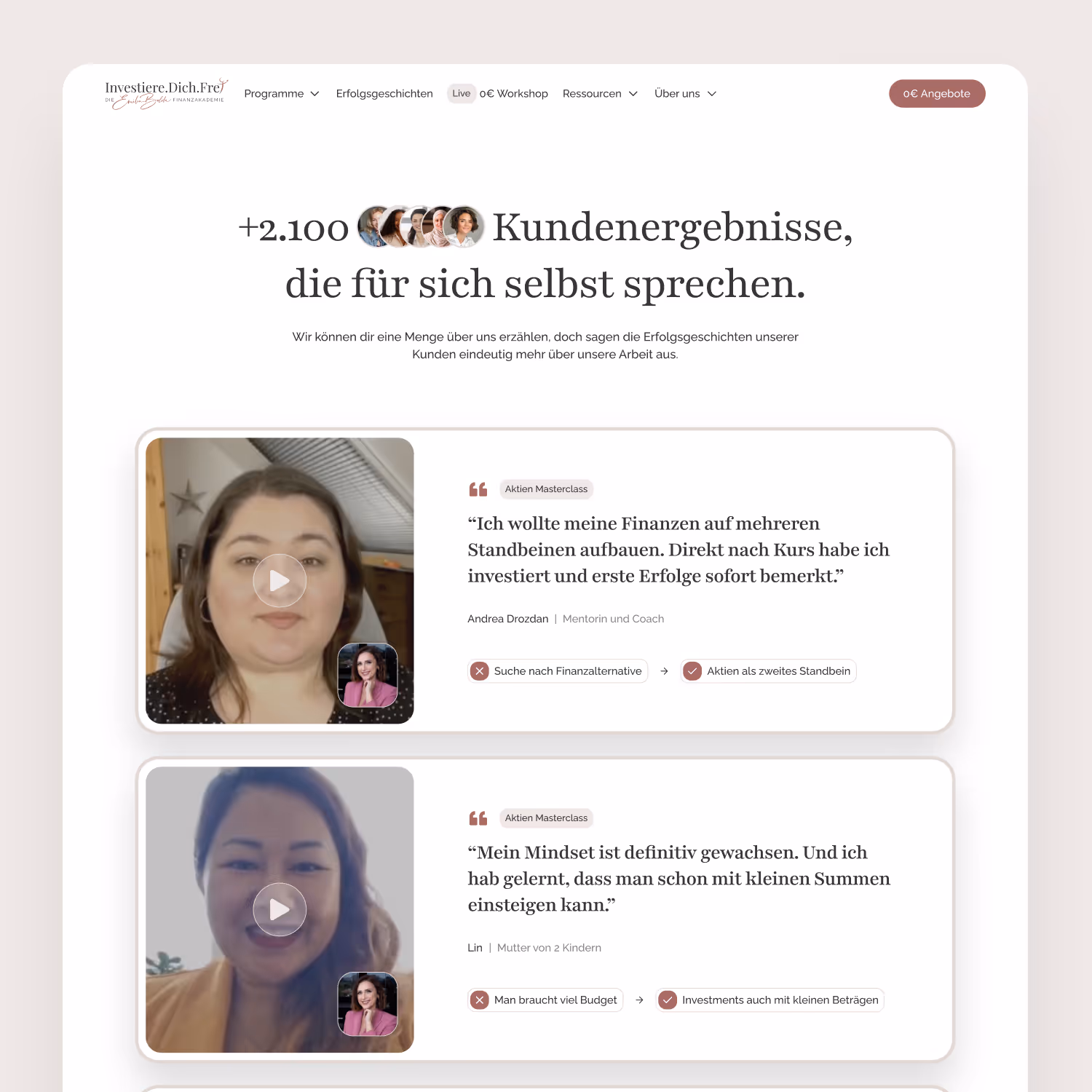
Starting position: Good offer, but no clear stage
After an intensive rebrand, one thing was clear: The brand Investiere.Dich.Frei had evolved. Only the website was left standing.
It was technically cumbersome, visually inconsistent and unclear in terms of content.
- Maintenance costs: Even small changes required a lot of time and know-how in WordPress.
- Performance: Numerous plugins made the site slow — particularly mobile.
- Unclear customer journey: Visitors didn't know where to start.
- Not a common thread: The new branding and content orientation barely took place online.
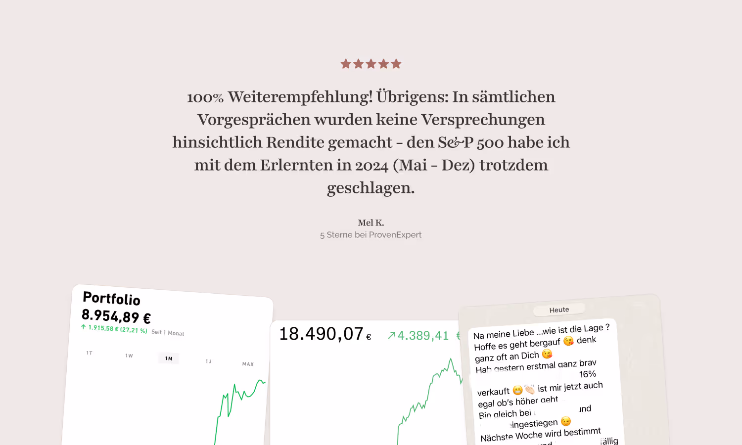
So the team knew that the offer was strong, but the website didn't convey that. Instead of building trust, she left questions behind.
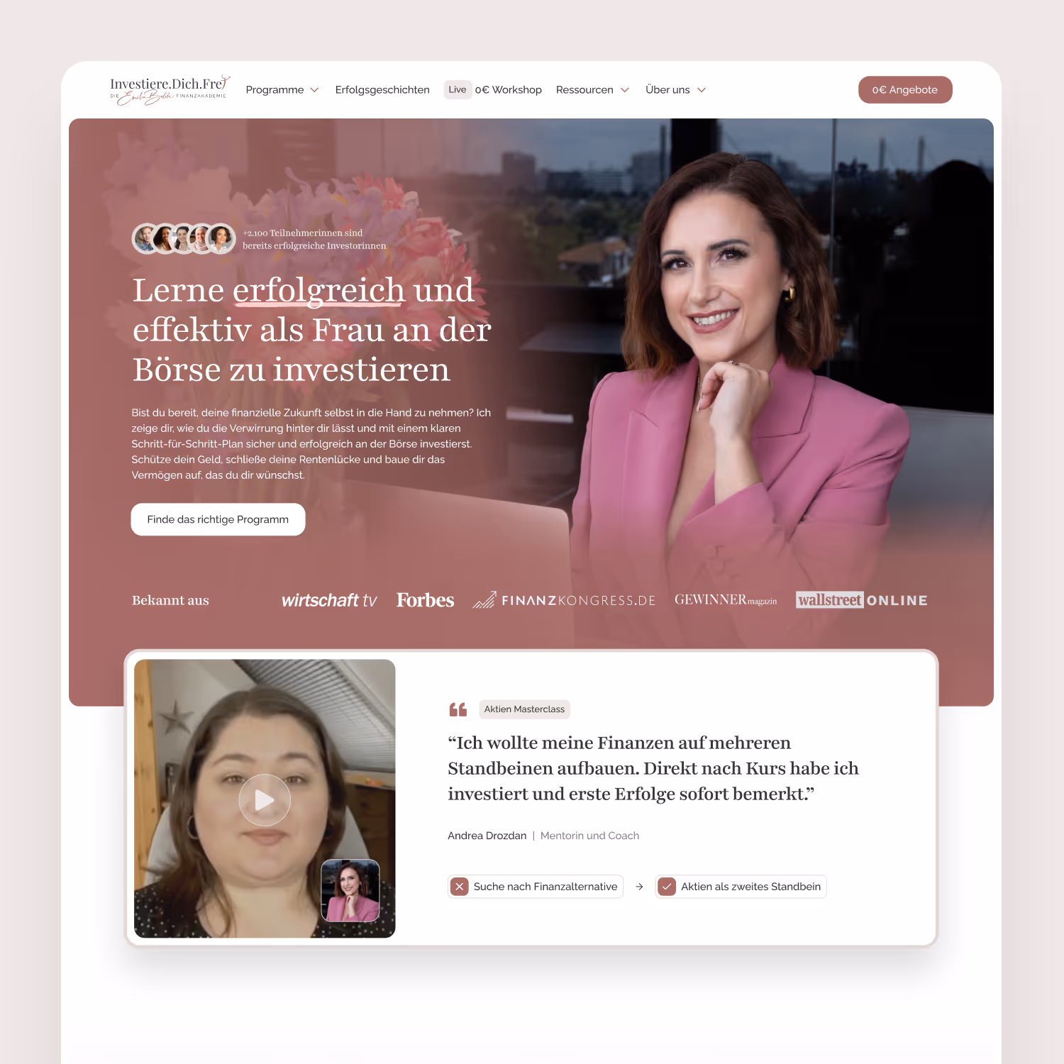
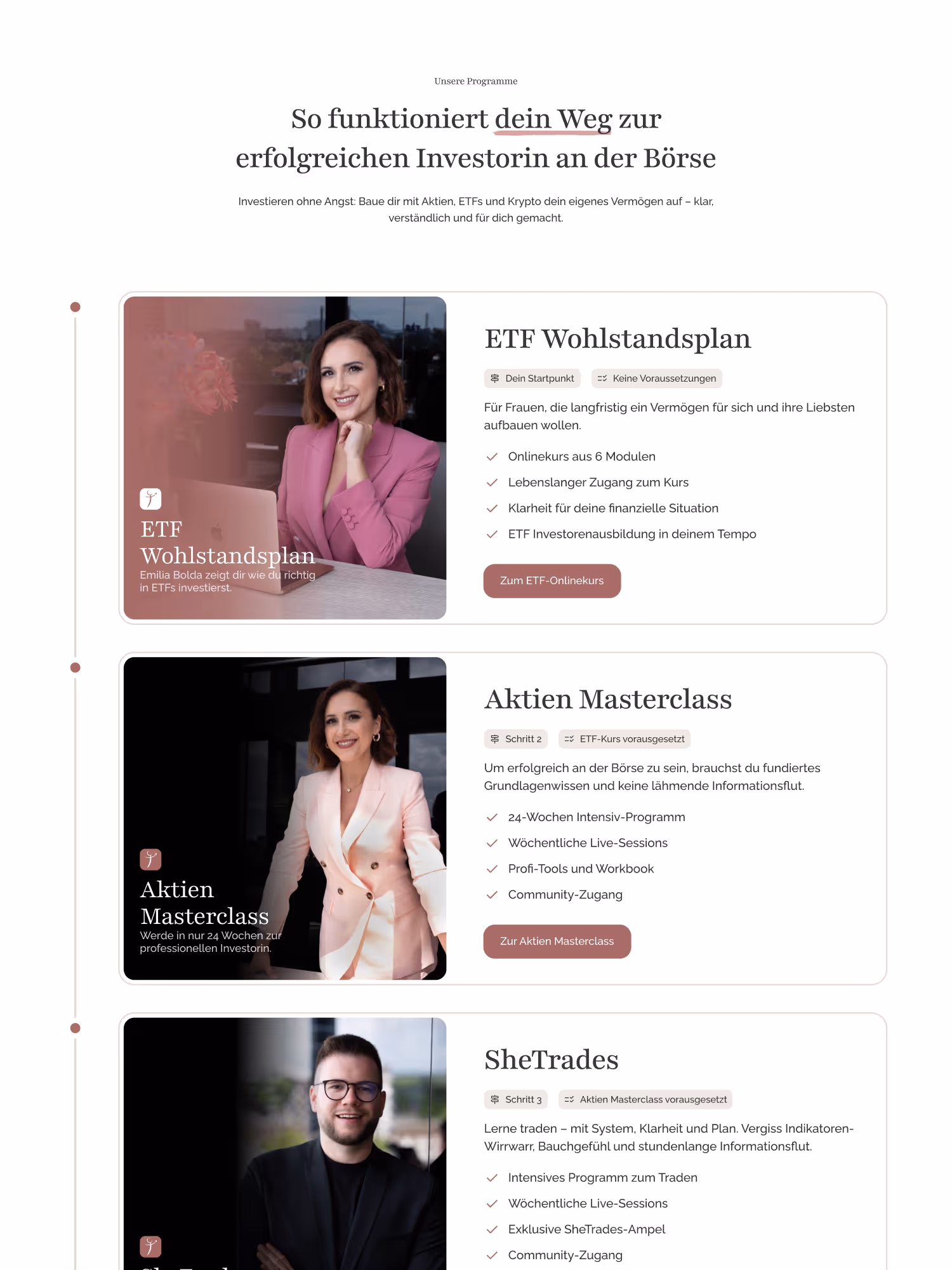
Objective: A website that sells before the sales call takes place
The goal was clear:
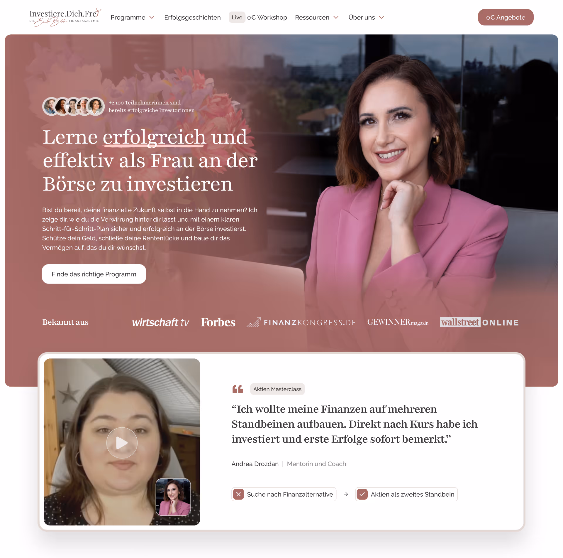
- One Website that reflects the brand — clear, self-confident, modern.
- One stringent user journey, which guides interested parties through content in a targeted manner.
- Better pre-qualification for sales calls — less educational work, more real sales calls.
- And above all: a platform that the team can maintain themselves, without technical hurdles.
In short: A website that works just as well as the financial courses themselves.
The journey: From complexity to clarity
Together with us Virtual Entity, a Webflow agency specialized in conversion-oriented websites, the new digital basis was created.
1. Sharpen the narrative
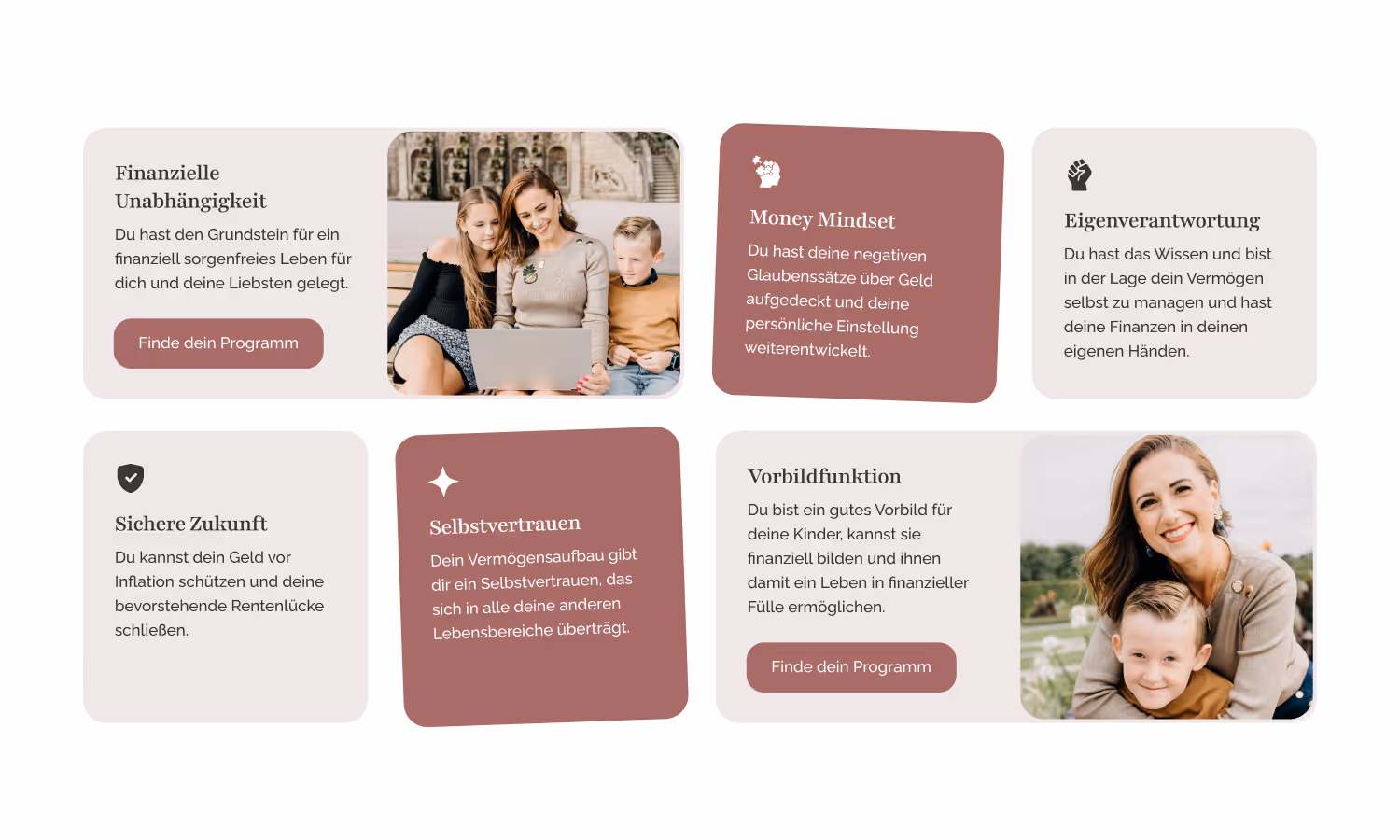
Before a single line of code was written, it was Storytelling in focus. What questions does a woman who wants to take charge of her finances ask herself? What barriers are holding them back?
These insights led to a individual narrative developed — less jargon, more empowerment. Instead of “understanding investments,” it was now: “Learn to let your money work for you. ”
2. Design based on new branding
The redesign was based on clarity and trust:
- Spacious white spaces, clear typography, warm color areas from the new branding.
- Instead of a faltering flood of information: a structured journey with clear calls-to-action.
- Mobile first — not as an afterthought, but as a starting point.
The result was a look & feel that made the brand's values visible: Clarity, expertise and proximity.
3. Webflow as a CMS
The decision to use Webflow was made quickly. After the experience with WordPress, there was a great desire for flexibility — but without the risks of countless plugins.
- Webflow CMS makes it possible to maintain blog posts, course pages and testimonials in one place.
- Components and reusable layouts ensure that new content goes online in minutes instead of hours.
- And thanks clean code The website is now running visibly faster — particularly on mobile devices.
“In the past, every small change felt like an eternity. Now we can spontaneously adapt content, create new courses or optimize texts — all without external help. ”
4. Scalability and future-proofing
The new setup is more than a redesign — it is a basis for growth. New course formats, campaigns or landing pages can be created with just a few clicks. The team can strategically build their content without relying on developers.
Result: Less need for explanation, more real conversations
Since the relaunch, the nature of customer conversations has changed noticeably.
- Better pre-qualification: Interested parties come with specific questions — no longer with fundamental uncertainty.
- Shorter sales calls: Less time for explanations, more time for decisions.
- Clarity in public image: The narrative runs through all pages — from the start page to the booking form.
- Faster content maintenance: Today, changes go live in minutes instead of days.