

If you're reading this post, we'll assume that you know Webflow like the back of your hand. If you're just starting out with SEO and Webflow, you may want to read this first: 6 SEO tips for Webflow beginners.
What advanced measures can I take to further improve my Webflow SEO?
Sometimes the basics aren't enough. For exactly this case, we have put together 5 pro tips for you below, which further increase the technical side of your SEO and significantly improve the findability and readability of your pages.
1. Page speed optimization
If a user has found your website on Google and even clicks on the link, you've done everything right for now. However, if the page loads too slowly, there is a high probability that the user will leave the page quickly. This so-called Bounce rate increases even further among mobile users and leads to two problems: First, users who have left a page once will probably never come back, and secondly, a high bounce rate worsens the ranking of a website on Google.
That's why it's essential to maximize your website's loading speed. 5 quick tips for this:
- Compress all images on webp and make sure that no image is > 200kb
- Clean up your CSS classes
- Remove unused animations (or avoid animations altogether)
- Avoid third-party scripts (such as Analytics and Co., these are not only critical from a data protection perspective, but also slow down your site)
- Compress your HTML, CSS, and JS
If you don't know how to do the individual steps off the bat, we have prepared a step-by-step guide for you here: Webflow Page Speed Guide for beginners and Webflow Page Speed Guide for Advanced Users
2. Responsiveness
Most website traffic today comes from mobile devices such as smartphones or tablets. So if your site is not optimized for these devices, but only looks really good on the desktop PC, your competition is happy, as your website is guaranteed to miss a worse ranking.
Therefore, make sure that your website is optimally displayed for all breakpoints. Mistakes that you should avoid:
- Overflow (content that is wider than the screen and thus leads to horizontal scrolling)
- Truncated content (do not simply “cut” Overflow, but ensure that all content is visible within the screen)
- Font sizes that are too small or too large (font sizes of headlines and paragraphs should be adapted to mobile devices. As a rule of thumb, you can proceed according to the following scheme: font size desktop > font size tablet > font size smartphone)
- Unscaled images and animations (make sure that images (similar to font sizes) are adapted to the new screen sizes; if you work with animations, they should take into account smaller screens or individual animations should be created for each breakpoint)
- Avoid hover animations on mobile (there is no mouse on mobile, so hover animations only work on desktop)
3. Check HTTP status codes
It always happens that old pages are deleted or the URL of a subpage changes. If this is the case, the old URL must always be 301 redirected to the new target URL. If this is not the case, a user receives a 404 error code and ends up on a default page. It's bad for your UX and SEO.

4. Control the indexing of your pages
By default, Google crawls all your subpages and indexes them in Google search as long as they have no errors. However, some pages (e.g. if you have a sandbox page to test new sections, or a style guide as a subpage in your website) should not appear in Google search, as they are not intended for site visitors. Set these pages with the tag <meta name="robots" content="noindex, nofollow">to “no-index” and tell search engines not to index the page.
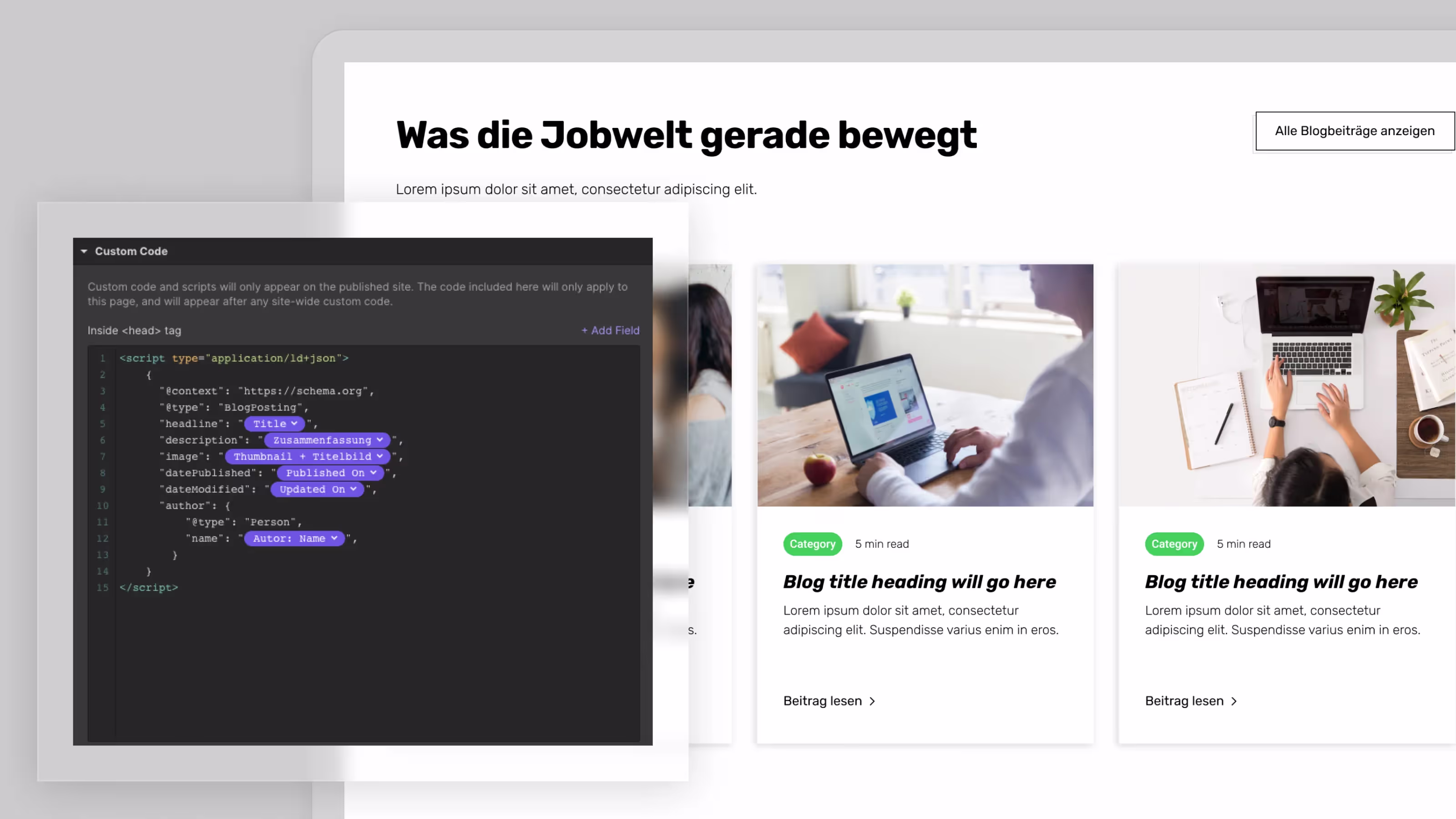
5. Use structured data for your blog posts
If you add structured data to your posts, Google and Co. understand your contributions better and can provide optimized information about them. Use the following scheme to add structured data to your Webflow website (in this Help Center article by Google - If you can find further information, should you want to embed even more structured data):
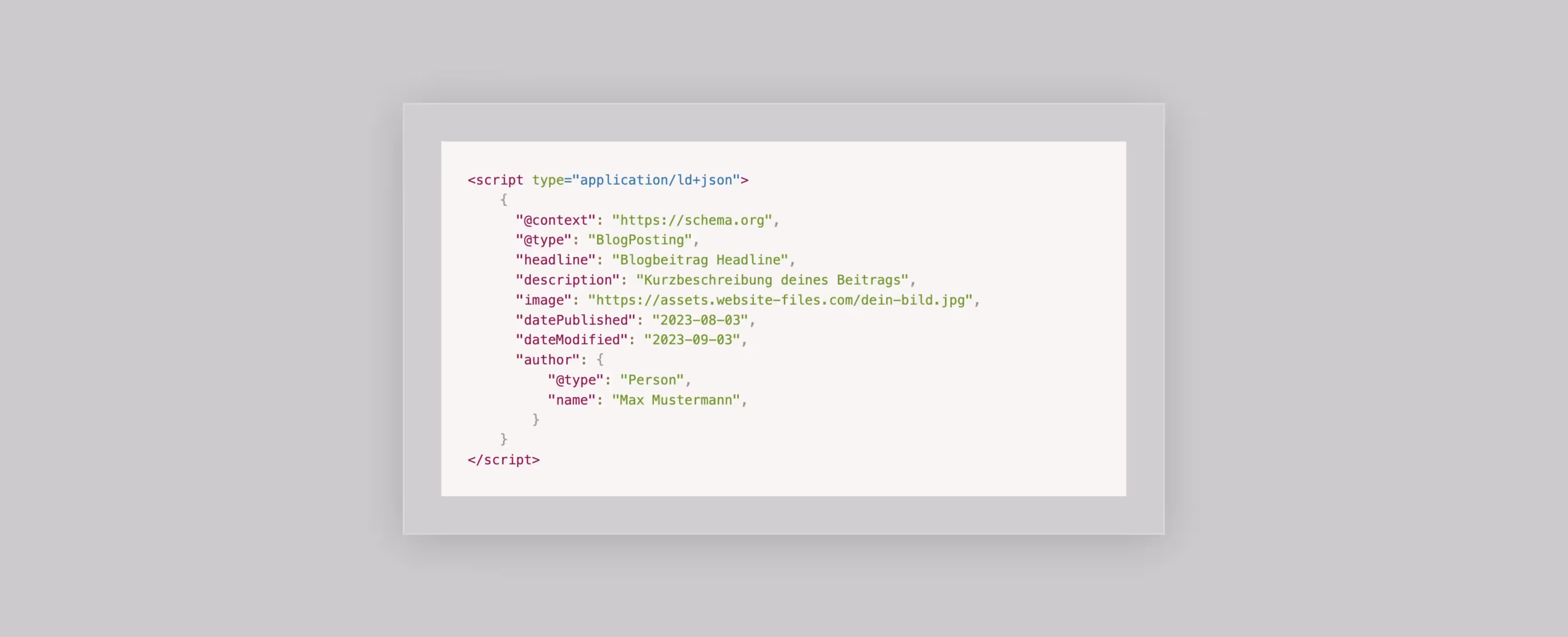
Of course, this can also be combined with the Webflow CMS. To do this, simply replace the static content with variables from the Webflow CMS using the following example:
As a long-standing Webflow Professional Partner, we have brought several Webflow websites up to speed in terms of SEO. So if you need help implementing the tips above, you can always contact us.